How to Not Design a Smartwatch →

In the next decade or so, I believe the smartwatch will replace the smartphone (and even the PC) for most of our everyday tasks. This vision, however, will require a total reimagination of the user interface; specifically, inputting data.

Samsung understands the vision. Unfortunately, they have no idea how to get there.

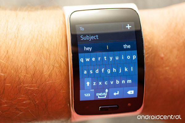
What they've done here with the Gear S is taken a smartphone and shrank it down to the size of a wristwatch. Who cares if a wrist-size keyboard won't work in the real world. A smartphone on a wrist sounds pretty cool, right? Keyboards worked on smartphones so obviously they'll work on the wrist, right? The Apple Watch won't have a keyboard but the Gear S does, so that makes the Gear S superior, right?

This is a perfect example of what happens when companies just say "yes" without understanding "why".

Google's Material Design →

I'm really excited for Google's new design language. One glaring annoyance that's bugged me since I got my first Android is the design inconsistency of the icons. Another thing that's bugged me is the default Halo theme that feels so cold and lifeless.

Material Design on the other hand looks fun, playful and full of personality. It looks like a joy to use, much like my beloved (and iOS-exclusive) Tweetbot app.

Android fans have always boasted how Android is open. But when it was completely open, Android's lack of design guidance resulted in a chaotic mess of garbage apps that showed very little unity or consistency.

From a user experience standpoint, I'm really glad Google is tightening ship and leading the way for the Android developer community. Google's designers are fantastic and I hope all Android users upgrade to Lollipop soon.

Re: Why CurrentC will beat out Apple Pay in the end →

Matthew Mombrea, IT World:

Apple Pay has the better technology but they lack the retail support to dominate. If you can't use Apple Pay almost everywhere, it's doomed. Some say that consumers will look to change where they shop based on their support of mobile payments but I have a hard time believing that. If anyone can pull this upset off it's Apple, but it will need the surrender of the largest retailers in the world who are fighting tooth and nail against credit card fees.

Good luck gaining consumer awareness of CurrentC in the first place.

Good luck getting consumers to download the CurrentC app vs. Apple Pay which will be built into every new iPhone model from this point on.

Good luck convincing consumers that holding up their iPhone with their thumb on TouchID is less convenient than:

  • Pulling out your smartphone from your pocket
  • Unlocking your smartphone
  • Opening your CurrentC application
  • Entering your 4-digit passcode
  • Pressing the Pay button
  • Either scannig the Secure Paycode that the cashier presents (default) or pressing the Show button at the bottom of your screen to allow the cashier to scan your Secure Paycode
  • Selecting the payment account that you would like to use
  • Pressing the Pay Now button

That's great that CurrentC is backed by a lot of big name retailers. But for mobile payments to catch on in the U.S., you need to satisfy multiple groups of players: consumers, merchants, credit card companies, and banks. Apple has solid backing by all four at launch time. CurrentC doesn't even have two.

Good luck with that.

UPDATE: CurrentC has already been hacked. LOL.

The End of Apps as We Know Them →

Intercom:

The idea of having a screen full of icons, representing independent apps, that need to be opened to experience them, is making less and less sense. The idea that these apps sit in the background, pushing content into a central experience, is making more and more sense. That central experience may be something that looks like a notification centre today, or something similar to Google Now, or something entirely new.

The primary design pattern here is cards. Critically it’s not cards as a simple interaction design pattern for an apps content, but as containers for content that can come from any app. This distinction may appear subtle at first glance, but it’s far from it.

I really love this cards metaphor that has been catching on lately; specifically, Google Now. And with the Smartwatch 2.0 era just coming around the corner, I think we'll be seeing this new design paradigm really start to blossom.

Remember, back in 2008 when the iTunes App Store was first introduced, nobody had any idea that we'd eventually have apps like Instagram, Snapchat, and Uber. I'm really stoked to think how wearable device user interfaces will evolve.

Why Apple took so long to make a large iPhone →

Jony Ive:

Many years ago, we made prototypes of phones with bigger screens. We made notebooks with bigger screens; it was a concept that we were familiar with. There were interesting features having a bigger screen, but the end result was a really lousy product because they were big and clunky like lots of the competitive phones are still…And we thought there is a danger you are seduced by a feature at the expense of making a great product. And so years ago we realized well this is going to be important that we have larger screens, but we needed to do a lot of things to make that larger screen yield a really competitive product.

It was very important to making [a phone with bigger screen] comfortable and actually feeling less wide than in reality it was.

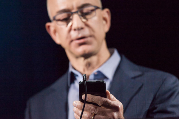
Jeff Bezos Source: Forbes

Contradicting Yourself →

Jason Fried retelling Jeff Bezos's observation of successful people:

He said people who were right a lot of the time were people who often changed their minds. He doesn’t think consistency of thought is a particularly positive trait. It’s perfectly healthy — encouraged, even — to have an idea tomorrow that contradicted your idea today.

He’s observed that the smartest people are constantly revising their understanding, reconsidering a problem they thought they’d already solved. They’re open to new points of view, new information, new ideas, contradictions, and challenges to their own way of thinking.

This doesn’t mean you shouldn’t have a well formed point of view, but it means you should consider your point of view as temporary.

Great advice.

I believe that the wisest people aren't the ones who have all the answers. Rather, they are the ones who constantly ask the right questions. And it's these same questions that should be asked not just once, but continually over time.

Never pigeonhole yourself into the "I'm going to do this this way because that's the way I've always done it" mentality. What holds true today may no longer hold true tomorrow.

Windows 10 - Continuum Concept →

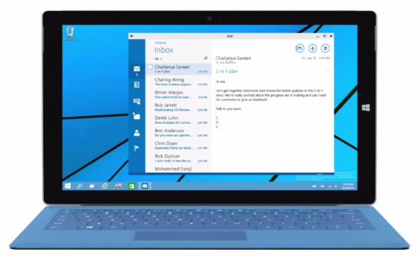
Now this is interesting. While I do believe there is a future for hybrid tablet-PCs, I do not believe the hardware technology is quite there yet. I'd love to one day be able to do full-time web development on a hybrid, while being able to hold my 500 GB of personal photos/video, and not having to pay over $999. That day will come eventually.

As for the software side, this "Continuum" concept seems like a great step in the right direction.

Why The Apple Watch Will Need The iPhone...For Now →

A Blog To Watch:

Apple actually made clever use of the Apple Watch's relationship with the iPhone. Apple Watch users will install an Apple Watch app on their iPhone, which will be used to download apps onto the watch as well as likely manage Apple Watch settings. A user's iPhone is also used to help with computational demands. Apple cleverly pushes a lot of processor needs to the phone in order to preserve Apple Watch battery life. Thus, the Apple Watch is snappier, with longer battery life because a lot of tasks can be off-loaded to the host phone.

Smart way to handle Apple Watch apps for the first few generations until the Apple Watch can stand on its own. Reminiscent of how the iPod first required iTunes and a computer until it evolved into the iPhone and iTouch.

iPad: The Microwave Oven of Computing →

Techinch, March 2011:

Looking just at the specs, a microwave didn't make sense to many. So manufacturers bundled them with cookbooks that detailed the many things you could cook in a microwave. Look, you can make this great Chinese dish in a microwave! Our microwave lets you bake a cake! Need a hot cup of this complicated spiced cider? It'll only take 15 steps in our microwave! They thought the microwave needed to be a full oven, and more.

But, wonder of all wonders, people started buying microwaves and using them regularly. In the store, a microwave didn't seem like a must-have item to many, but once you incorporated it into your daily life, it was irreplaceable. [...]

The microwave isn't easier for every cooking task, and perhaps it takes longer to prepare a complicated meal in a microwave. Perhaps no award winning meal will be created in one, unless it's a special contest for microwave cooking. But it simplified simple cooking, and consumers around the world saw it as a necessary piece of equipment within in years of it becoming popular. It didn't need to be an oven, and didn't need to be better than an oven. It just needed to be the best for some certain cooking scenarios, and that was enough to win the hearts and minds of people around the world.

Last year, Apple introduced the iPad, a computing device many have struggled to classify. It's bigger than a smartphone or iPod, smaller than a computer, but can do some things you'd otherwise do on both of these. You can type a document in Pages or find your way with GPS and Google Maps. So what makes it so special? From a specs perspective, tablets don't make sense. It cost just under $500, but if you've already invested in a computer and a smartphone, it's just another expense. Plus, netbooks only cost $300, right?

In 10 years, young adults will look at the tablet the same way we look at microwaves.