Creativity is just connecting things. When you ask creative people how they did something, they feel a little guilty because they didn’t really do it. They just saw something. It seemed obvious to them after a while; that’s because they were able to connect experiences they’ve had and synthesize new things.
—Steve Jobs
Upgrade your user, not your product.
Don't build better cameras, build better photographers.
—Kathy Sierra
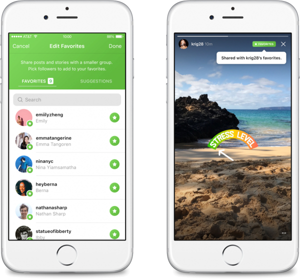
Instagram Tests 'Favorites' to Separate Friends, Followers →
Instagram has begun testing a way to share posts with a more limited group of friends. Called favorites, the feature attempts to improve on earlier social network friend lists, encouraging users to post more often by giving them more control over their audience. If it rolls out broadly, the feature could turn Instagram into the default place to share for more groups of friends — and reshape the social dynamics of Instagram in the process.
Before Instagram developed favorites, users tried to build versions of it for themselves. They created so-called “Finstagrams” — private Instagram accounts followed only a handful of their closest friends. Or they posted photos publicly and then deleted them after their close friends had acknowledged them with a like.
This is something I've felt should be standard across any mainstream social network: the ability to distinguish Friends from Followers so users have more control over what they share.
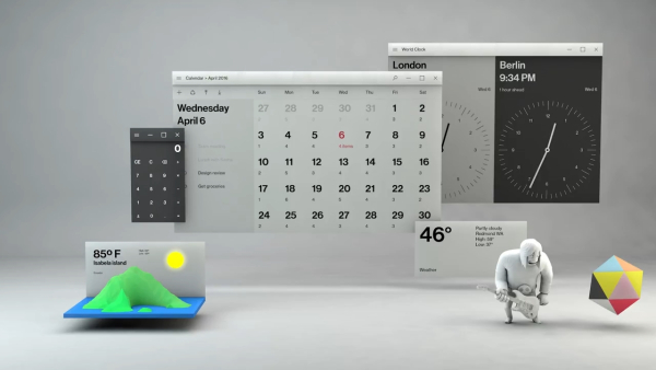
Microsoft's Fluent Design Language →
This is GORGEOUS. For years, I've seen Apple register patents that imagined desktops in a 3D space. I've had a hard time envisioning that until now.
This concept by Microsoft makes me incredibly excited for augmented/mixed reality.
One thing I like about the Galaxy S8 is they finally got rid of their logo from the front.
Let the industrial design speak for itself.
Good products help us do things. Great products change the things we do. Exceptional products change us.
—Horace Dediu
iOS 10: The Future of iOS Apps is Widgets, Extensions →
iDownloadBlog explains that with iOS 10, you can now unlock the iPhone without launching the home screen:
When an iOS device is unlocked, the OS gives apps access to encrypted data.
As a result, launching Camera from the Lock screen of an unlocked device gives you unrestricted access to the whole Photos library as opposed to showing only the images taken during that particular session if you launch Camera from the Lock screen of a locked device.
Here’s another example.
For security reasons, many people prevent Lock screen access for the Notification Center. As much as this great for preventing someone from sniffing around your Notification Center, it’s also a nuisance as reading your incoming alerts requires you to unlock the device.
In addition to these lock screen changes, iOS 10 adds more ways to access apps without launching them individually:
- bring up Siri and interact with richer app widgets
- swipe on the home and lock screens to interact with richer app widgets
- 3D Touch apps on the home screen for widgets and shortcuts
- quickly switch to third-party iMessage apps without leaving the conversation (e.g. send Paypal money to friends)
- perform third-party actions directly within Apple Maps (e.g. book an Uber ride)
These changes show that Apple's once proud, "There's an app for that," tagline is evolving into something different. Since iOS 2, we've thought of the operating system as the platform which you use to launch traditional apps. Now, Apple is turning specific parts of iOS 10 — Siri, iMessage, Apple Maps, Lock Screen, Widget panel, 3D Touch Quick Access — into their own little platforms.
This makes things interesting for app development. Maybe in the future, app developers won't be saying, "I need to create apps for iPhone, iPad, Mac, Apple TV, and Apple Watch ."
Maybe in the future, they'll be saying, "I need to create widgets and extensions for Siri/iMessage/Maps/Music/etc" and everything will simply work on all Apple devices.
Designing for Apple Watch →
Rocket Insights recently shared the lessons they learned when designing an Apple Watch app for Virgin Pulse:
We created a Watch version of each of the features on the iPhone. We built clickable mockups and tested them. What we learned surprised us. Most features were not useful as Watch features...in fact most were actually harder to use there. […]
We discovered that the only features worth replicating were those that were actually better on the Watch. Not just the same, but easier, faster, or more delightful.
A big misconception for smartwatch doubters is that the smartwatch is supposed to replace the phone. But actual smartwatch owners tell a very different story:
When we asked them what apps they use and like on their Apple Watch the answer was invariably apps that delivered intelligent notifications. This was fascinating...that answer was consistent across the board. People are not using Watch apps as much as they are merely receiving quick notifications about their lives. So Watch software is, in a sense, a notification framework for your iPhone app. The Watch is merely the delivery device for it.
Rocket Insights also sums up perfectly how each Watch UI element should be used:
- Complications are for frequently changing data.
- Glances are for data that changes a few times per day.
- Notifications are for real-time updates.
- Apps are the very last thing a user interacts with, therefore all of the longer-term, slower-changing data should be left here.
I still see a lot of smartwatch doubters and Apple naysayers proclaiming that the Apple Watch is already a failure. The reality is, smartwatch app design is still in its infancy, and it takes a lot for people to rewire theirs brains and get it right — smartwatch apps are not just shrunken-down smartphone apps.
We're barely in the "fart app" phase of watch apps. But eventually, someone will figure out the next Instagram/Snapchat/Uber for the wrist.
Facebook Events UX →
Facebook employees describe the challenges with naming the "Decline" button for Facebook Events:
“People hated clicking that,” says Matosich. “That’s the language of the button, that’s what goes out to the host. It spiders out: ‘So and so declined my event, did I do something wrong?'” When it came time for Facebook to revamp its events pages, the team considered a variety of possibilities to replace decline: No, Can’t Go, Not Going, No Thanks, and Unable to Go were among the options.
Eventually, Can’t Go was the chosen winner, because while Not Going is more literally accurate, the intent of Can’t Go is truer to what people want to communicate. “People don’t know how much care we put into this. It’s one little button, it’s one little option, but we want to think through all the use cases,” Matosich explains, saying the team testing the phrases across different UIs and scenarios (how it looked in different notification screens, and as a response to birthday parties, memorial services, book clubs). “We don’t believe in edge cases, we want to find something that works for everyone. We don’t want to alienate anyone or make anyone feel icky … we don’t want to put words in anyone’s mouth.”
When Facebook replaced “Decline” with “Can’t Go,” a funny thing happened: People actually started using it.
For graphic artists, every pixel matters. For sound engineers, every decibel matters. For web developers, every kilobyte matters.
For user experience designers, every word matters.
Reducing Friction: The Difference Between Good and Great Design →
And that’s part of the reason why Apple’s “me too”s end up feeling like “me-first”s. In the age of digital, execution is staggeringly important, and there isn’t a single company in existence that can pull off polish and simplicity like Apple. While other companies struggle just to get all of their devices and services talking to one another, Tim Cook and friends are worrying over the details that actually make consumers pay attention. The products don’t just work the way they should; they feel the way they should. Reducing friction, even a single click, can change the way a user perceives an entire product. […] [Emphasis mine]
That’s partly Apple’s magic show: being able to blend the familiar, the known, and the obvious with something (even a little bit) totally new. The company’s senior vice-president of marketing, Phil Schiller, told Businessweek “You can’t just say, ‘Here it is. It does the same thing 5 percent better than last year.’ Nobody cares.” But that five per cent is often the difference between making something that people talk about, and making something they forget. That five per cent is where Apple lives.